What that column of red and green numbers is really saying
Open a trading page and there's always a column of red and green numbers flickering away at the side. That column is the order book — OKX labels the web tab exactly that, and the same data drawn as a chart is its Depth view. The red block is other people's sell orders that haven't been filled yet, the green block is buy orders that haven't been filled, and both are queued up in price order.
What it shows you is how much size is sitting at each price right now. Read it properly and you can settle two very practical questions: how far apart buyers and sellers currently are, and whether your own order will go through smoothly. What it isn't is a forecast. Resting orders change constantly and can be pulled at any moment, and this note comes back to that more than once.
Contents
- This column is the order book: a list of orders that haven't filled
- Where to find it on OKX
- Price, Amount, Total: what each column is for
- Best bid, best ask, and the gap in the middle
- The depth chart is just Total drawn as a picture
- Thick book or thin: why the same market order fills at different prices
- A big resting order can be pulled at any time
- A few things the order book can't tell you
This column is the order book: a list of orders that haven't filled
An analogy first. Picture a street where people buy and sell second-hand bikes, and everyone chalks their price on the wall. Sellers write "200 to sell" and "210 to sell"; buyers write "180 to buy" and "190 to buy". Until somebody agrees, the prices just sit there. Sort every price on that wall into order and copy them into a table, and you have an order book.
The OKX Learn piece on order books puts the definition plainly: an order book is a list of every pending buy and sell order for a specific cryptocurrency, and exchanges use it to match buyers with sellers and to determine the price. Note the word pending — orders that have already been filled are not in this table.
So every row in it is somebody saying "at this price I'm willing to sell this much" or "at this price I'm willing to buy this much". How you actually place those orders is covered in limit, market and stop orders; this note is only about reading them.
Where to find it on OKX
The OKX help centre article on pair information is specific about where to look. Summarised from the page itself:
| Platform | Where the help page says it is | How the help page describes it |
|---|---|---|
| App | The right-hand side of the Buy/Sell page | The order book, where the red area at the top is sell orders and the green area at the bottom is buy orders |
| App | Below the candlestick page | Two tabs, Depth and Fill (Fill is the list of recent trades) |
| Web | Trade — Spot, the middle section of the page | Two tabs, Order book and Last trades, with sell orders in red above and buy orders in green below |
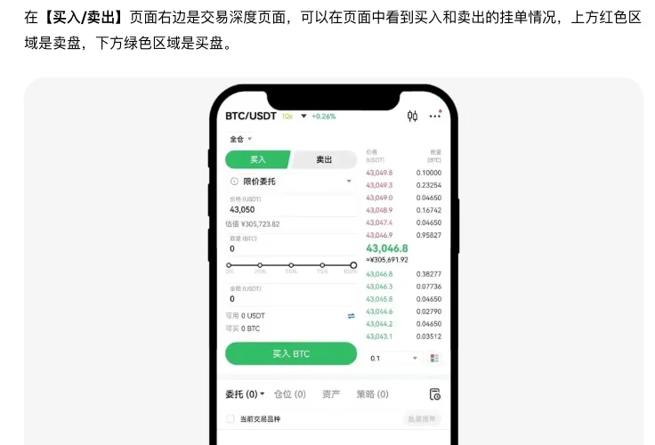
One thing worth flagging in advance: the layout isn't always top-and-bottom. A different OKX help page, the one on candlestick chart questions and settings, describes the order book with buy orders on the left and sell orders on the right. So you may run into either layout. Red for sell and green for buy is the default colour scheme, and if you've changed the up/down colours in settings, the red and green here may swap over with them. Don't memorise the position or the colour — go by the buy/sell labels and by whatever interface is actually in front of you.
If you haven't even found the candlestick page yet, start with setting up the chart on OKX, which walks through roughly where each of them sits in the interface.
Price, Amount, Total: what each column is for
The OKX Learn piece uses a BTC/USDT order book as its example, and the usual layout is three columns: Price, Amount and Total. Your own interface may show only Price and Amount — the App illustration in the screenshot above does exactly that — and it reads the same way.
- Price. In red is the ask price, the price somebody wants to sell at; in green is the bid price, the price somebody wants to buy at. On OKX, as the Learn piece describes it, both sides run top to bottom from highest to lowest. Under the default colour scheme, red and green here mark selling and buying, not falling and rising.
- Amount. How much is queued at that price. Crypto can be traded in whole units or in fractions of a unit, so decimals here are perfectly normal.
- Total. Usually the running total from the price nearest the middle out to the row you're looking at. The Learn piece describes it as a measure of liquidity around a given price level; in plain terms, how much you could buy (or sell) in total by the time you reach this price. Some platforms show a cash value in this column instead; if you're not sure whether the column is cumulative, check whether the figure keeps growing as you move away from the middle.
- The bars. Some interfaces draw a red or green horizontal bar behind each row to show size at a glance. Some scale it to that one row, some to the running total, so work out which before you read anything into it.
Descriptions alone get confusing, so here's an illustrative book we made up. The numbers are rounded off purely to keep the arithmetic easy, and they aren't any coin's real quotes:
| Side | Price | Amount | Total |
|---|---|---|---|
| Sell (red) | 20.5 | 6 | 13 |
| Sell (red) | 20.4 | 5 | 7 |
| Sell (red) | 20.3 | 2 | 2 |
| Buy (green) | 20.1 | 4 | 4 |
| Buy (green) | 20.0 | 3 | 7 |
| Buy (green) | 19.9 | 8 | 15 |
You can see the pattern: the closer to the middle, the better the price is for you and the smaller the running total; the further out to either end, the larger the total. The 20.3 at the bottom of the sell side is the cheapest anyone is currently selling at, the 20.1 at the top of the buy side is the most anyone is currently offering to pay, and the two of them stand next to each other in the middle.
Best bid, best ask, and the gap in the middle
Those two middle rows have names. The best ask is the lowest price anyone is currently selling at; the best bid is the highest price anyone is currently buying at. The Learn piece calls the pair the top of the book and notes that these orders are most often filled first. The reasoning is simple enough: if you want to buy immediately, the best ask is what you buy from, and if you want to sell immediately, the best bid is who you sell to.
Best ask minus best bid is the bid-ask spread. In the illustrative table that's 20.3 minus 20.1, a spread of 0.2.
What does the spread tell you? The Learn piece puts it this way: a smaller spread usually means there are plenty of buyers and sellers and liquidity is good, while a wider spread suggests thin liquidity and can come with sharper price swings. It works the same way on that bike street — the busier it is, the closer together the "to sell" and "to buy" prices are chalked.
The most useful point for a beginner: the spread is what you hand over the moment you buy and sell straight back again, before fees are even counted. And a spread only means something relative to the price. A gap of 0.2 on a coin trading at 20 and the same 0.2 on a coin trading at 20,000 are completely different things.
The depth chart is just Total drawn as a picture
The order book is rows of digits, and staring at it gets tiring. What a depth chart does is very simple: it draws the running totals on each side as a shape.
Try sketching the illustrative table in your head. The common layout puts price along the bottom and cumulative size up the side. Dead centre is the gap between the 20.1 best bid and the 20.3 best ask; off to one side is the buy queue, with totals running 4, then 7, then 15; off to the other is the sell queue, with 2, then 7, then 13. Each step out lifts the line a little, and what you get is two staircases climbing away from the middle.
There are three things to look at:
- The gap in the middle. The wider it is, the wider the spread.
- How steep the steps are. Where a stretch climbs sharply, a lot of size is queued at those prices and getting through it costs more; where it rises gently, little is queued and a few orders walk straight past.
- Which side is taller. That only tells you which side has more resting orders at this moment. It doesn't add up to "about to rise" or "about to fall".
On the OKX App there's a Depth tab below the candlestick page, which is where this sort of thing lives. Depth charts differ in the details from one platform to the next, so it's enough to hold on to what the picture represents — cumulative resting size — and take the exact appearance from whatever you're looking at.
Thick book or thin: why the same market order fills at different prices
Start with the matching example the Learn piece gives (in essence):
A market order to buy 20 BTC comes in, and the best sell order is for only 15 BTC. The exchange uses all 15 of those first, which leaves 5 outstanding, so it moves to the next price. The next sell order is for 10 BTC, and 5 are taken from it to complete the buy order.
In other words, a market order doesn't fill "at the price on your screen" — it works outwards from the best price, level by level, until the size is covered. Using the illustrative book above, suppose you place a market order to buy 5:
The best ask at 20.3 has only 2
All 2 fill at 20.3, leaving 3 outstanding.
One level out, 20.4 has 5
3 are taken from it and fill at 20.4, completing the 5.
Work out the average fill
(2 × 20.3 + 3 × 20.4) ÷ 5 = 20.36, which is 0.06 above the 20.3 you saw. Illustrative figures, fees not included.
Change the setup: buy the same 5, but with 10 sitting at the best ask, and all 5 fill at 20.3. That is the difference between a thick book and a thin one. Thick means the levels near the middle hold plenty, so an order your size doesn't get through the first one; thin means each level holds very little, and a slightly larger order has to eat through several in a row.
A fill that lands away from the price you expected is called slippage. The Learn piece is clear about it: high slippage usually happens when liquidity is low, and where market depth is low, large market orders can move the price around. For a beginner that comes down to two things:
- Before you send a market order, glance at the amounts on the levels near the middle and compare them with the size you're trading. If your size is smaller than the first level, there's little to worry about; if it's more than the first few levels combined, think again. Bear in mind that in fast-moving conditions the first level can change in a blink.
- If the fill price really matters to you, consider a limit order: you set the price yourself, and the trade-off is that it may never fill at all.
The order book is a queue that is rewritten constantly. Reading it well can save you slippage and spread, but it will not tell you which way the price is going. Chasing because the buy side looks thick, or bailing because the sell side does, is an easy way to be led around by an order that gets cancelled a moment later. Crypto prices swing hard, and with futures and leverage losses are multiplied and can take your entire stake. Practise on a demo account or with money you barely notice. This site covers chart-reading basics only; it is not investment advice and it does not predict which way prices will go.
A big resting order can be pulled at any time
Watch an order book for a while and you'll hit a level where the amount is suddenly enormous. The first reaction most people have is that somebody is going to hold the price up there, or dump into it there.
Hold on a moment. That entry is only an order that hasn't filled, and orders can be cancelled. The OKX help centre is blunt about this when it covers order status: the tab it calls Open positions holds the orders that have not been filled (open orders, in other words, not positions anyone is holding), while Order history holds the ones that have been filled or cancelled. The large order you're looking at sits in somebody else's open orders, and a second later it may have moved into their cancelled ones.
The Learn piece raises the same thing when it lists the limitations: order books are sometimes prone to flashing false signals, often caused by large orders placed to manipulate the market, and some traders react to those signals without doing any other analysis and lose money as a result.
So yes, people do treat a cluster of buy orders as a clue to where support might be, and a cluster of sell orders as a clue to resistance. Notice that the Learn piece hedges that passage with "may indicate" and "could hint". As a clue, fine; not as a conclusion. Chalk can be rubbed out, and the wall can come down. There's a fuller treatment in how to find support and resistance.
A few things the order book can't tell you
- It only covers one exchange. You're reading the OKX book; everywhere else keeps its own. As the Learn piece says outright, prices on a single exchange's order book may not represent an asset's true value.
- It has a present tense but no past. The order book only shows current orders, not what has already traded. To find out how much real money has actually changed hands, you need the trade history and volume — how volume goes with the candles covers that.
- It says nothing about the next move. A thick buy side doesn't mean it's going up; a thick sell side doesn't mean it's going down. The order book describes where people are willing to queue at this moment, not where the price will be shortly. Why no technical tool answers that question is set out in why candles can't predict the future.
Back to that wall covered in chalked prices. The order book lets you see clearly, at this moment, who is willing to queue at which price and how much they've put up — from which you know whether the spread is wide and how many levels your own order will eat through. Use it to work out how to place this order more sensibly, not to guess whether the next move is up or down, and you're using it correctly.
Sources: the interface locations, the red and green areas and the order status wording come from the OKX help centre articles View information related to pairs (App/Web) and How do I use and adjust the candlestick chart?; the three columns, top of the book, spread, slippage, the matching example and the limitations come from OKX Learn's What is an order book in crypto?. All checked in 2026-09. Exchange interfaces get redesigned, so go by what you see at the time; the price table in this article is made up for illustration.
Common questions
What do the red and the green in the order book mean?
Under the default colour scheme, red in the OKX order book is sell orders that haven't filled, and green is buy orders that haven't filled. The red and green mark which side of the trade an order is on, not whether the price is rising or falling. Some interfaces stack the two sides top and bottom, others put them left and right, and if you've changed the up/down colours the red and green may swap, so go by the buy/sell labels.
What do best bid and best ask mean?
The best ask is the lowest price anyone is currently selling at and the best bid is the highest price anyone is currently buying at. The two sit next to each other in the middle of the order book and are usually filled first. Best ask minus best bid is the bid-ask spread: a narrow spread generally indicates good liquidity, a wide one generally indicates thin liquidity and possibly bigger price swings.
Why did my market order fill at a different price from the one on screen?
A market order works outwards from the best price level, and when the first level doesn't hold enough it carries on into the next one, so the average fill price ends up away from the price you saw. That is slippage. The thinner the book and the larger your order, the more obvious the gap tends to be.
A big order has appeared in the book — does that mean someone is about to push the price up or down?
You can't conclude that. A big order is only an order that hasn't filled and it can be cancelled at any time; the OKX order history includes orders that were cancelled without filling. People do treat clusters of resting orders as a clue to support or resistance, but a clue is all it is, not a conclusion.
How does the depth chart relate to the order book?
The depth chart simply draws the cumulative resting size on both sides of the order book as a shape, commonly with price along the bottom and cumulative size up the side. The gap in the middle corresponds to the bid-ask spread, and the more sharply a stretch climbs the more size is queued across those prices. Like the order book, it reflects only the orders resting right now and predicts nothing.